Popups That Grow Your List Without Killing Conversion
Your popup is the front door to every email you will ever send. Learn the multi-step, zero-party-data popup strategy that grows lists 6-12% without hurting sales.
Why Your Popup Is the Front Door
Your popup is the front door to every email and text you will ever send.
If it underperforms, everything downstream shrinks with it: fewer subscribers, fewer buyers, less revenue from flows you have not even built yet.
Last year my team helped our e-commerce clients generate over $23 million from email and SMS. That number starts at the popup. Most people think building a list is about collecting as many emails as possible. That is completely wrong. You want a high-quality, engaged list of buyers, not just subscribers, and the popup is where that list is either built right or built cheap.
Most brands leave thousands of dollars on the table with a generic corner popup.
Build one that actually converts and you compound every dollar for years.
Prefer to watch? Here is the full walkthrough.

Multi-Step Beats Single-Step
A single-step popup asks for an email and disappears. That is a missed opportunity.
The moment someone is willing to engage is the moment to learn what they actually want.
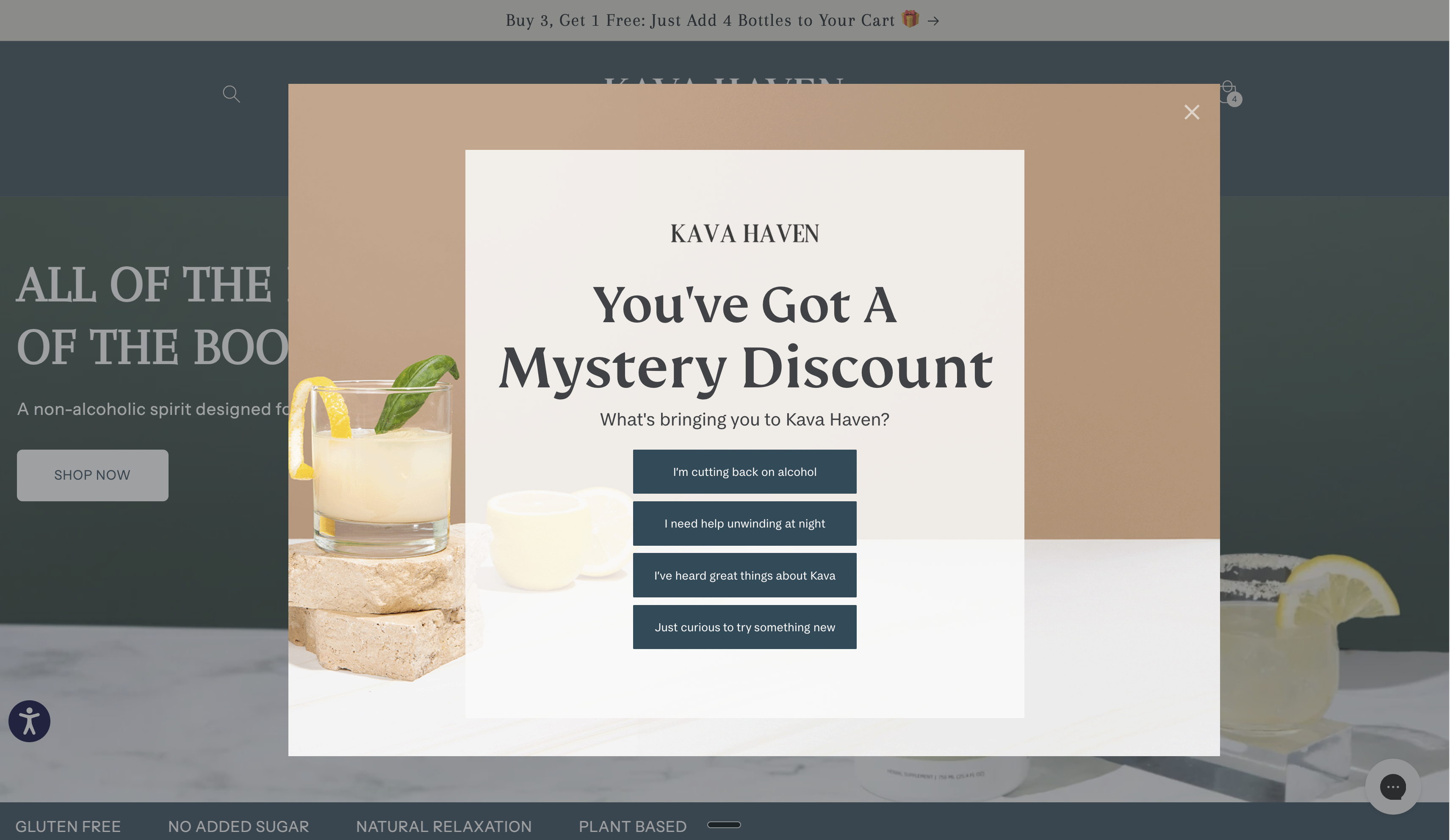
Multi-step popups win because they capture zero-party data. You ask the visitor a question first, they tell you what they are shopping for, then you email them based on that answer.
You are not guessing anymore. You know.
That four-step flow is exactly what drove 12% and 5.8% submit rates and $445,000 in revenue for one client.
Separate desktop and mobile versions let you optimize for both, tune each to different behavior, and read the data on its own.
Full-screen designs with a clear value proposition and minimal fields are what convert right now. With the right offer structure and design, we see 15 to 20% conversion rates, not the 2-5% most brands settle for.
Set the Bait: The Offer Is Everything
No one wants to give you their email or their phone number. You have to give them a reason.
This is where almost everyone goes wrong. They slap together a generic offer nobody wants, then wonder why the list is not growing. The truth is simple: nobody wants more emails. They want something actually valuable.
A discount code is the safe bet and it rarely misses. But if a discount does not fit your brand, build what I call a MICRO solution: one small thing that solves one specific pain point for your ideal customer.
Sell skincare? The offer becomes "the three-minute morning routine that prevents breakouts" or "five ingredients to remove from your skincare routine today." Package it as a short PDF or video and give it away as the lead magnet.
The offer is the single biggest lever on your submit rate. A boring offer at 3% and a sharp offer at 15% pull the same traffic. One of them builds a real list.
Why "Just a Small Discreet Popup" Leaves Money on the Table
Founders ask for a small corner popup all the time. "The big ones feel too pushy."
Here is the reality you are missing.
After a visitor gives you their email, the popup is gone forever. Welcome popups only show to non-subscribers.
So you would rather have a big popup with a high conversion rate that a subscriber sees once, than a small popup hardly anyone opts into that stays on site forever.
Shrink the popup, soften the CTA, make it dismissible in half a second, and your list grows at 2,000 emails a month instead of 20,000. You are in the business of building customer relationships that drive repeat revenue, not being polite.
- Less visible, so fewer signups
- No room to communicate value fast
- Often ignored or closed instantly
- No zero-party data, so you email blind
- Covers 75%+ of screen for full attention
- Room for the offer, visuals, and trust signals
- Zero-party data step at the start
- Email first, SMS second, one input per step
Small popups still have a use. Run them as a second-chance form on exit-intent, or as a slide-in for visitors who dismissed the main one.
Do the same with a footer form. Make it big, put the same welcome offer on it, and drop it at the bottom of every page. Anyone who skips the popup gets one more place to opt in.
Use both as backup, not as your primary capture.
How Popup Data Powers Everything Downstream
The zero-party data you collect in step one is not a nice-to-have. It is the fuel for your segmentation and your flows.
When a subscriber tells you what they want, you can drop them into the right welcome flow, show them the products they care about, and personalize every send after that.
The welcome sequence is the payoff. It delivers the offer you promised, builds trust with a few value-based emails, then presents the logical next step, which is usually the first purchase. Feed it good popup data and every one of those emails gets sharper.
That is the difference between a $50K list and a $500K list built from the same traffic.
Single-step forms hover near the 2-5% industry average. Multi-step forms with a zero-party data step land in the 6-12% range.
Benchmarks
| Metric | Needs Work | Good | Excellent |
|---|---|---|---|
| Popup submit rate | Under 3% | 6-9% | 10-12%+ |
| SMS opt-in rate | Under 2% | 4-6% | 6%+ |
| Steps in the form | 1 | 2-3 | 3-4 |
| Screen coverage | Corner slide-in | Half screen | 75%+ |
Common Mistakes
- Asking for email only. Add a micro-commitment step first so you capture zero-party data and learn what the subscriber wants.
- Cramming multiple inputs into one step. Use one input per step. Email first, SMS second.
- Making the popup tiny to feel less pushy. Less visible means fewer signups. Cover 75%+ of the screen and make the offer the boldest element.
- Running one popup for desktop and mobile. Build separate versions so you can optimize and read the data for each.
- Setting it and forgetting it. Split-test the offer, timing, and layout regularly so results climb over time.
- Hiding the close button. Make it easy to close. A trapped visitor bounces and hurts your site metrics.
Get Expert Help
Our team builds multi-step, zero-party-data popups that convert in the 6-12% range and feed clean data straight into your flows.
We build on Klaviyo, the same platform brands like Vans, Glossier, Gymshark, Stanley, and Skims run on, because the segmentation and Shopify integration are unmatched for e-commerce.
We handle the design, the split-testing, and the Klaviyo setup so your list grows without hurting sales.
Need help implementing this?
We build and manage complete email & SMS programs for DTC brands. Get a custom plan for your brand.
Apply Now