How to Design an Email in Figma (Step by Step)
The ZHS Figma workflow for designing emails that look premium and build fast. From modular sections to handoff, the exact process behind our client creative.
- Build the creative system described in this lesson
- QA the design across production and rendering constraints
Should you design emails in Figma or in your ESP?
Use Figma when it helps your team make a repeatable visual system; use the ESP when it is the faster, safer place to build accessible, live email content. The ZHS production preference is Figma for composition and a component-based ESP build for delivery, but no design tool is a universal winner.
Treat this as a ZHS production system, not an inbox-client requirement: design a mobile-first, single-column composition; reuse an approved component library; and validate the final ESP build on real devices. Keep essential copy, controls, links, preference access, and legal content as live email content wherever the build supports it.
Google's sender requirements apply regardless of whether the visual source is Figma, an ESP editor, or another tool. This lesson's creative workflow does not replace authentication, consent, unsubscribe, or reputation controls.
Figma can be where the composition happens, while the ESP remains the production environment. Use the tool that lets your team preserve hierarchy, reusable components, accessible content, and a dependable handoff.
The goal is speed with control: modular sections you reuse, a clean handoff, and a design system that is tested in the actual environment rather than assumed to render identically everywhere.
This is a ZHS production workflow, not a causal revenue claim for a specific layout. Its value is that the team can review the creative system and the final send separately.
Figma is strong for reusable components, precise layouts, and collaborative handoff. Canva or an ESP-first process can still be appropriate for a lighter workflow. Choose based on the team's production needs, not a blanket tool hierarchy.
Prefer video? Watch the walkthrough.
What is the step-by-step email design workflow in Figma?
The ZHS workflow moves from decision to system to build to QA: lock the offer and primary action, compose with reusable sections, build the content in the ESP, and test the received email before it ships. The elapsed time should be planned from the team's own asset, approval, and QA constraints rather than presented as a universal promise.
Here is the exact order we move through.
The Figma-to-Klaviyo workflow
- 01BriefLock the offer and primary action
Decide what the email needs to communicate and the action it should make easy.
- 02SystemSet the frame and component rules
Use the approved brand styles, spacing, and reusable sections as the starting point.
- 03ComposeAssemble the creative
Add current product imagery, hierarchy, copy, and the primary action.
- 04BuildCreate the ESP version
Use the delivery environment for links, live content, preference controls, and any imagery that is appropriate for the message.
- 05QATest the received email
Review the received message on relevant devices and inboxes, then confirm links and accessible content before sending.
A repeatable production sequence. The article remains canonical; this visual is the presenter-ready summary.
How wide should an email be in Figma?
There is no universal Figma frame width that guarantees inbox rendering. Start with a mobile-first, single-column composition that matches the ESP template you will actually send, then test the received email in the environments that matter to your audience. The ZHS standard is validated hierarchy and readability, not a magic canvas number.
Create a frame that reflects the intended build constraints, keep the hierarchy legible at mobile size, and avoid relying on a desktop composition to prove that an email is usable. A single column is often the clearest starting point, but test the final implementation rather than treating the source file as proof.
Before you touch a section, load your brand into Figma styles: primary and secondary colors, heading and body fonts, and your spacing scale. Now every section you build pulls from the same source. Change a color once and it updates everywhere.
Here is a trick that saves real time. Hit O to bring your brand colors in as little circle swatches parked above your canvas. Keep your guideline images up there too. Now you can grab the exact brand color on any layer without hunting, and the whole email stays cohesive. When you want to color-match one element to another, hit I and click the color you want. That one shortcut does most of the visual consistency work for you.
Learn the shortcuts and this whole flow gets fast: F for a frame, T for text, R for a rectangle, Shift+A to wrap a selection in auto layout, I to color-match, S to slice.
This setup gives the team a shared visual source of truth and makes changes easier to review without unnecessary brand drift.
Treat spacing as a tested build decision. Image-based padding can be useful for art-directed sections, while live HTML spacing is often better for accessible content. Avoid assuming either method will behave the same in every client; inspect the received email.
How do you build reusable email templates in Figma?
Build a focused component library so repeatable sections start from approved patterns rather than a blank canvas. Use linked components for stable elements, then adapt the product, copy, and imagery to the specific message. This can reduce production time, but the actual cycle depends on asset, approval, and QA requirements.
The whole point of Figma here is that you never start from zero.
Build a small library of components once: a few hero headers, a couple of reusable body blocks, a product showcase row, and a clean footer. Turn them into Figma components so every instance stays linked.
From that library you can assemble master templates: launch, sale, editorial, or whatever recurring message jobs the brand actually needs. Each send still deserves a content and QA review; reuse is there to improve consistency, not to make the email generic.
- Hero header variants
- Body and benefit blocks
- Product showcase rows
- Footer with links and legal
- Product photography
- Headline and subhead
- The single CTA
- Offer and dates
How many CTAs should an email have?
Give the email one primary action, then make any supporting links clearly secondary. A message can contain more than one link when readers genuinely need choices, but competing primary CTAs should be intentional and tested rather than accidental.
Every email answers one question: what is the single action you want?
Design the whole layout to point there. Lead with the outcome in the hero, not a spec sheet. Give the primary action one button, high on the email, styled to stand out. Repeat that same button lower down if you want, but do not add a second competing action.
Put the primary action where it follows the minimum context needed to make it meaningful. In a short offer-led email, that may be near the top; in an education-led email, readers may need proof first. Test the actual message rather than treating one placement rule as a conversion guarantee.
Build the primary control as live content where the ESP supports it, with adequate visual contrast, a clear label, and enough room for the copy. Use auto layout in the source design to keep the component stable as language changes, then verify the final email's behavior.
Single column does the hierarchy work for you. The reader takes it in order: hero, headline, proof, button. You control the sequence instead of hoping the eye lands right. When everything looks important, nothing gets the click.
Use real product imagery, not stock or filler. The photo does the selling on a launch or a sale, so it has to be your actual product, shot on brand. AI tools are useful for a hero backdrop or a quick variation, but the real email still gets built here with real assets.
How do you export a Figma email into Klaviyo?
Use Figma to prepare the visual assets that make sense for the message, then build the email in Klaviyo with working links and appropriate live content. Avoid making an entire email a single image: critical copy, actions, preference controls, and legal content should remain usable if images are unavailable. QA the received email on real devices and in relevant appearance modes before sending.
Figma is the design source; Klaviyo is the delivery build. Keeping the two roles clear makes a handoff reviewable without promising a fixed production speed.
For art-directed sections, export individual assets at a resolution that stays clear in the final build without imposing unreasonable load weight. Add them as image blocks with meaningful alt text and destination links. Keep the content that must remain selectable, understandable, or actionable in the ESP's live build.
Do not rely on blanket click targets as a substitute for a clear primary action. Each linked asset should have an intentional destination, and the email should still make sense when images are blocked.
Keep the footer and other essential content as live HTML, not an image. This improves usability and makes legal, preference, and contact content more reliable to render. It is not a standalone deliverability fix; sender authentication, consent, audience quality, and reputation still require their own controls.
Here is the anatomy of the finished build, top to bottom.
How do you export a Figma email into Klaviyo
- 01Visual assetsArt-directed sections
Export only the visual sections that benefit from images, then give each asset a meaningful destination and alt text.
- 02Live buildEssential email content
Keep key copy, actions, preference access, and legal content usable in the ESP build.
- 03Received-message QAValidate the delivery
Inspect the real email for hierarchy, links, image behavior, readability, and relevant appearance modes.
Structured from the canonical article steps for responsive reading and presenter mode.
Then QA before you send. Open the received email on a representative phone and desktop environment. If readers have to hunt for the action or cannot understand the message with images unavailable, revise the build. Check dark mode where it is relevant to your audience.
| Stage | Tool | What you own |
|---|---|---|
| Design | Figma | Mobile-first hierarchy, grid, modular sections |
| Prepare assets | Figma | Art-directed assets sized for clarity and sensible load weight |
| Build | Klaviyo | Live content, intentional image use, links, alt text, preference access |
| QA | Real device | Mobile read, dark mode, link check |
Creative format alone does not determine inbox placement. Treat sender authentication, consent, audience quality, complaint signals, and reputation as separate operational controls; use the deliverability guide for that work.
What are the most common email design mistakes in Figma?
The recurring mistakes are treating the source design as the final email, rebuilding stable components from scratch, skipping brand styles, stacking competing primary actions, relying on untested spacing, exporting soft or heavy assets, ignoring the received-message QA, and making the entire email an image. The ZHS standard is a tested, usable build, not a universal canvas or export recipe.
- Designing only for a monitor. Start mobile-first and validate the received email at the screen sizes that matter to the audience.
- Drawing every email from scratch. Build a component library once, then assemble master templates and swap content per send.
- Skipping brand styles in Figma. Load colors, fonts, and spacing as styles so changes remain controlled.
- Stacking competing CTAs. Pick one action, give it one button high on the email, and repeat that same button if needed.
- Relying on spacer blocks. Bake padding into the exported images so spacing survives dark mode and every client.
- Exporting without checking clarity and load weight. Choose assets based on the final build, then inspect the received email.
- Assuming one source layout proves every rendering. Use a shared design system, but test the actual delivery instead of assuming identical output.
- Making the whole email an image. Keep essential content and actions live and usable in the ESP build.
Get Expert Help
Our team builds email design systems that make the final message easier to produce, review, and QA. Want a workflow built for speed and consistency instead of one-off guesswork? We can help.
More patterns to study
Curated creative references for this lesson. Study the mechanism, then adapt it to your own audience, offer, and evidence.
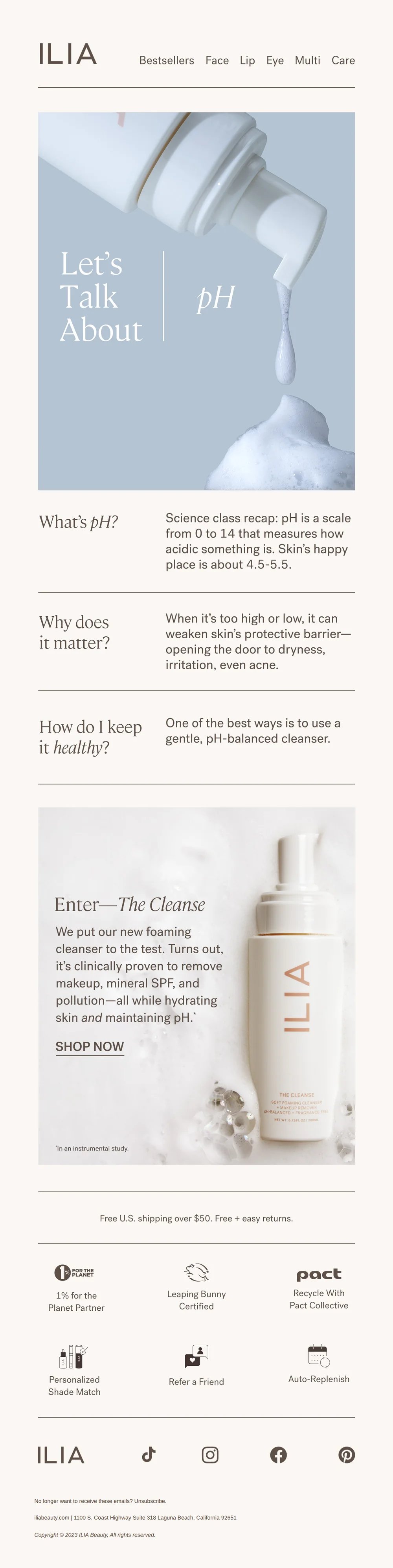
“Why does my skin’s pH matter?”
Pattern: teach skin pH science to sell new cleanser.
Use it here: A restrained editorial system can make education easy to scan; translate its hierarchy into reusable Figma sections and a live ESP build.
Open reference in new tab
the maudern.
Pattern: Wuthering Heights x Maude gothic intimacy collab kit.
Use it here: Use Figma to define the visual rules behind an art-directed send, then keep critical copy, links, and controls usable in the delivery build.
Open reference in new tabCreative and design curation only. These are role references, not reported revenue, conversion, or a promise that the exact tactic will transfer unchanged.
Need help implementing this?
We build and manage complete email & SMS programs for DTC brands. Get a custom plan for your brand.
Get Your Free Audit + Gameplan