How to Design Emails That Look Premium (and Convert)
Good email design is not about looking pretty. Learn the ZHS approach to emails that read clean on mobile, move fast to build, and actually drive clicks.
- Build the creative system described in this lesson
- QA the design across production and rendering constraints
No prior lesson required.
What makes an email design convert?
Effective email design makes the message understandable quickly and directs attention toward one primary action. Mobile readability, hierarchy, contrast, brand consistency, and rendering QA matter more than decorative complexity.
An email design works when it moves the eye toward one primary action and makes the message easy to understand on a small screen. Use a single-column foundation, establish one primary CTA, and test both light and dark rendering. Treat the design as one part of a message system that also includes audience, offer, copy, timing, and measurement.
ZHS production standard: design mobile first, give the email one clear visual hierarchy and primary action, and QA the final build in the inbox contexts that matter to the audience. Use plain-text and designed variants for the jobs they suit, then measure the relevant outcome rather than assuming one format wins everywhere.
Basic ESP templates can be a useful starting point, but visual polish is not the goal by itself.
The job of an email design is to make the message and action easy to understand. Decorative elements should support that job, not compete with it.
The rules below are the ZHS production starting point, not universal conversion laws. Validate them in the actual clients, device mix, audience, and campaign context before turning them into a permanent template rule.
Would you rather watch than read? I cover the whole thing here.
Here is what that looks like in practice.

Should you design emails for mobile or desktop?
Design mobile first. Device mix varies by brand, but the small-screen view is where hierarchy, readable text, tap targets, and overflow failures are easiest to spot. Start with a single-column foundation and confirm the rendered result in the clients your audience uses.
Review the phone view before approving the desktop view. A layout that looks spacious in an editor can become dense or awkward on a narrow screen.
ZHS uses a single-column email foundation as its default because it gives the reader a predictable sequence: message, proof, and action. Use multi-column content only when it remains legible and tappable in the target mobile clients; do not assume the editor's collapse behavior is the inbox result.
Single column also builds hierarchy for free. The reader takes it in order: hero, headline, proof, button. You control the sequence instead of hoping the eye lands in the right place.
Set type for actual readability. Use a body size and line length that remains comfortable on a phone, then inspect it on a real device. If the reader has to zoom or hunt for the offer, revise the hierarchy rather than relying on a desktop preview.
Use font fallbacks and test them. Web-font support varies by mailbox client. Specify a readable fallback stack, confirm the actual render, and use image-based type only when it does not hide essential copy or impair accessibility. A Figma handoff can make the hierarchy easier to review before production.
Make buttons easy to tap. Big CTA buttons your thumb can hit without effort. No tiny links clustered together. Everything built for a quick glance, not a novel.
Before any email goes out, open it on your own phone. If you have to pinch to read the copy or hunt for the button, the design failed. Fix it before you send.
How many CTAs should an email have?
Start with one primary CTA. Make the intended action visually distinct and repeat the same action lower in a longer email when that helps the reader. Add secondary routes only when they serve a deliberate job and you are willing to measure the tradeoff.
Clear hierarchy comes down to one question: what is the single thing you want this email to do?
Lead with the outcome, not the spec. "Greens that stay crisp all week" beats a paragraph about the tech behind it.
Give the primary action a distinct button and a direct label. Do not stack competing buttons that ask the reader to make multiple unrelated decisions at once.
Use the first fold to establish the message. The first screen should make the brand, promise, any important offer terms, and primary action easy to find. The exact sequence should follow the campaign job, and the mobile render should decide whether the hierarchy works.
Build the body from modular sections, not one giant graphic. Design a few hero headers, a few reusable body blocks, product showcases, and a clean footer. Mix and match those into master templates, then swap in the products and copy per send.
That is how you go from basic emails to a consistent, on-brand look without starting from scratch every time.
Should you put a nav bar or social icons in your emails?
Usually, keep them secondary. A navigation bar or social icon can be useful when the campaign's job is browsing, community, or editorial discovery, but they also create additional paths away from the primary action. Make the choice intentionally and test it in the relevant program.
Two habits quietly leak conversions, and both live at the edges of your email.
Keep the header focused. For a conversion-led send, a logo and clear promise often preserve more attention than a category menu. If discovery links are important, place and label them so they do not obscure the primary action, then review click behavior rather than assuming one layout always wins.
Use social links only when they earn their place. They can support a community or creator-led message, but they are not a default conversion tactic. Keep compliance and preference links intact regardless of the creative choice.
Every additional link competes for attention. Treat navigation and social links as purposeful secondary actions, then compare their effect with the campaign's actual primary metric.
When should you send plain text emails?
Use plain-text-style emails when a direct, personal note is more useful than a visual product story: founder messages, service updates, review requests, follow-up, or re-engagement can be good candidates. The right mix and result vary by audience and campaign job, so test the format against a comparable designed alternative when possible.
Here is the move most brands miss. Every other email in your customer's inbox is designed to look like marketing. Plain text breaks the pattern.
The format can feel direct and fast to build, but it still needs the same factual, accessibility, consent, and link QA as any other send.
Use the format where its plainness supports the message. Keep a designed option for product launches, visually led offers, and content where the image does real explanatory work.
The sender's voice matters more than pretending an email is manually written. In Klaviyo or another ESP, choose the simplest format that preserves the intended voice and links, then use the plain-text email playbook to decide where to test it.
- Product launches and drops
- Sales with a visual hero
- Editorial and lifestyle sends
- Anything where the image sells
- Founder and CEO notes
- Review requests after purchase
- Last-touch cart and win-back
- Reactivating a cold list
You do not pick one or the other. You run both in the mix.
How do you design emails for dark mode?
Dark-mode behavior varies by mailbox provider, device, and audience. Test important sends in both light and dark contexts, make logos readable against changed backgrounds, and verify that spacing and contrast survive the actual render.
The share of readers using dark mode is not a universal constant. Measure what you can from your own audience and protect against common rendering failures either way.
If you ignore it, logos, backgrounds, text contrast, and image edges can render differently from the editor preview. Those failures can make an otherwise clear email difficult to read.
Use resilient image treatments and HTML carefully. Image-based sections can protect a composition but can also hide text from readers when images are blocked; HTML text can improve accessibility but needs inbox-specific testing. Choose the mix based on the content and validate it in real clients.
Whichever you pick, test every email yourself in dark mode before you hit send. For the full checklist, see how to optimize your emails for dark mode.
| Do | Don't |
|---|---|
| Build spacing into your images | Rely on spacer blocks that break in dark mode |
| Keep logos readable on any background | Assume your logo shows on black |
| Test countdown timers in both modes | Trust that timers render everywhere |
| Send more plain text, it looks great in both | Alternate image, text, image, text |
Alternating image and text rows can create visible seams in some dark-mode implementations. Keep an eye on those transitions and use plain text when it is the right content format, not as a blanket workaround.
How fast can you build a designed email now?
The turnaround depends on the team, approval path, asset readiness, and complexity of the build. A reusable system can shorten the work, but speed should not skip factual review, link QA, accessibility, rendering, or compliance checks.
Without reusable assets and a clear handoff, creative work can stall in briefing, revision, export, and build steps. Map those bottlenecks before choosing a tool or promising a turnaround.
Modern tools can reduce repetitive work: lock the offer and angle, generate or source visual options, select the strongest, add the approved copy and CTA, then build and QA in the ESP.
When the operating system is ready, the team can react to a product update or moment without rebuilding the design language from scratch.
One honest note. The tools are not there yet for generating full client emails end to end. We still build the real thing in Figma. AI is a hero shot and background tool today, not a replacement for design judgment. Use it for speed on the visual side, not to skip the craft, and our guide on using AI to design emails faster shows where it holds up.
Why does brand consistency matter in email?
Consistency makes an email system easier to recognize, review, and produce. Use shared color, type, spacing, and voice rules so a campaign can feel on-brand without recreating the visual language every time; do not treat consistency itself as a guaranteed open-rate lever.
The brands with the best emails are not the flashiest. They are the most consistent.
Clean layouts that let the product shine. Neutral space and no clutter when you launch a collection. Ingredient or benefit callouts paired with a clear CTA. Bold color-blocking that stops the scroll and matches the brand story.
Define the brand rules: colors, type, spacing, image treatment, and voice. Then leave room for campaign-specific choices when the audience or offer needs a different emphasis.
What are the most common email design mistakes?
The common mistakes are approving only the desktop editor view, making text hard to read, hiding the primary CTA, stacking competing actions, adding secondary links by default, skipping dark-mode and client QA, and rebuilding every email from zero. Use this as a review checklist, not a claim that each item has the same impact in every program.
- Designing only on desktop. Build and test the smallest relevant view before approving the layout.
- Tiny or low-contrast text. Review real-device readability and revise type, spacing, or contrast before shipping.
- Burying the CTA below the fold. Make the primary action easy to find in the mobile render.
- Stacking multiple CTAs. Pick one primary action and repeat that button instead of competing for the click.
- Keeping a nav bar in the header by default. Give secondary links a deliberate job and review the tradeoff.
- Adding social icons by default. Include them when they support the message, not simply because the template has a footer slot.
- Skipping the dark-mode test. Verify the inbox render where logo, contrast, and imagery could change.
- Alternating image and text rows without QA. Check for seams or stripes and adjust the composition when needed.
- Sending only designed emails. Test plain-text-style messages when a direct, personal note fits the campaign job.
- Rebuilding every email from zero. Work from modular sections and master templates, then swap in products and copy.
Get Expert Help
Our team builds and reviews email systems for DTC brands, including mobile hierarchy, rendering QA, reusable modules, and the connection between creative choices and campaign goals. Want a design system built for speed and consistency instead of one-off guesswork? We can help.
More patterns to study
Curated creative references for this lesson. Study the mechanism, then adapt it to your own audience, offer, and evidence.

“a little gothic foreplay.”
Pattern: Gothic Wuthering Heights collab for intimacy products.
Use it here: Study how one visual world carries the subject, imagery, and hierarchy; rebuild the system for your brand rather than copying third-party art.
Open reference in new tab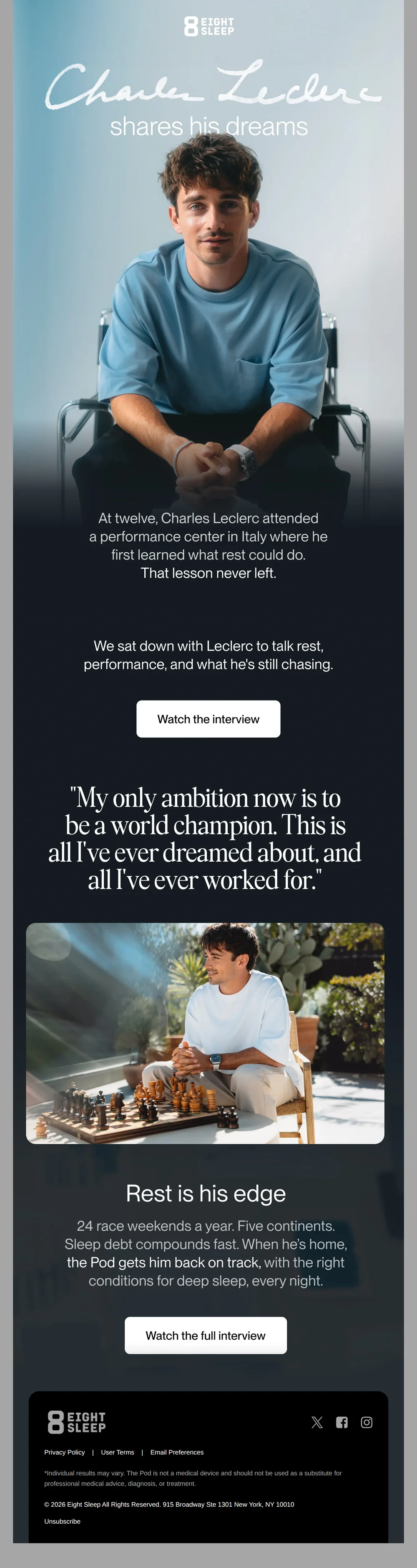
What does Charles Leclerc dream about?
Pattern: F1 champion reveals how sleep drives peak performance.
Use it here: A premium editorial layout works when proof, product, and action are sequenced for the reader instead of competing for the same attention.
Open reference in new tabCreative and design curation only. These are role references, not reported revenue, conversion, or a promise that the exact tactic will transfer unchanged.
Need help implementing this?
We build and manage complete email & SMS programs for DTC brands. Get a custom plan for your brand.
Get Your Free Audit + Gameplan